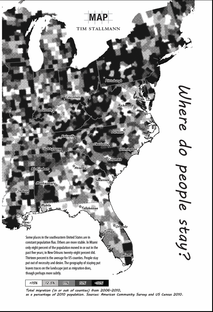
Where Do People Stay? (2013)
In this map for the Fall 2013 issue of Ecotone, I used Census migration data to visualize the geography of staying put in the Southeastern US.
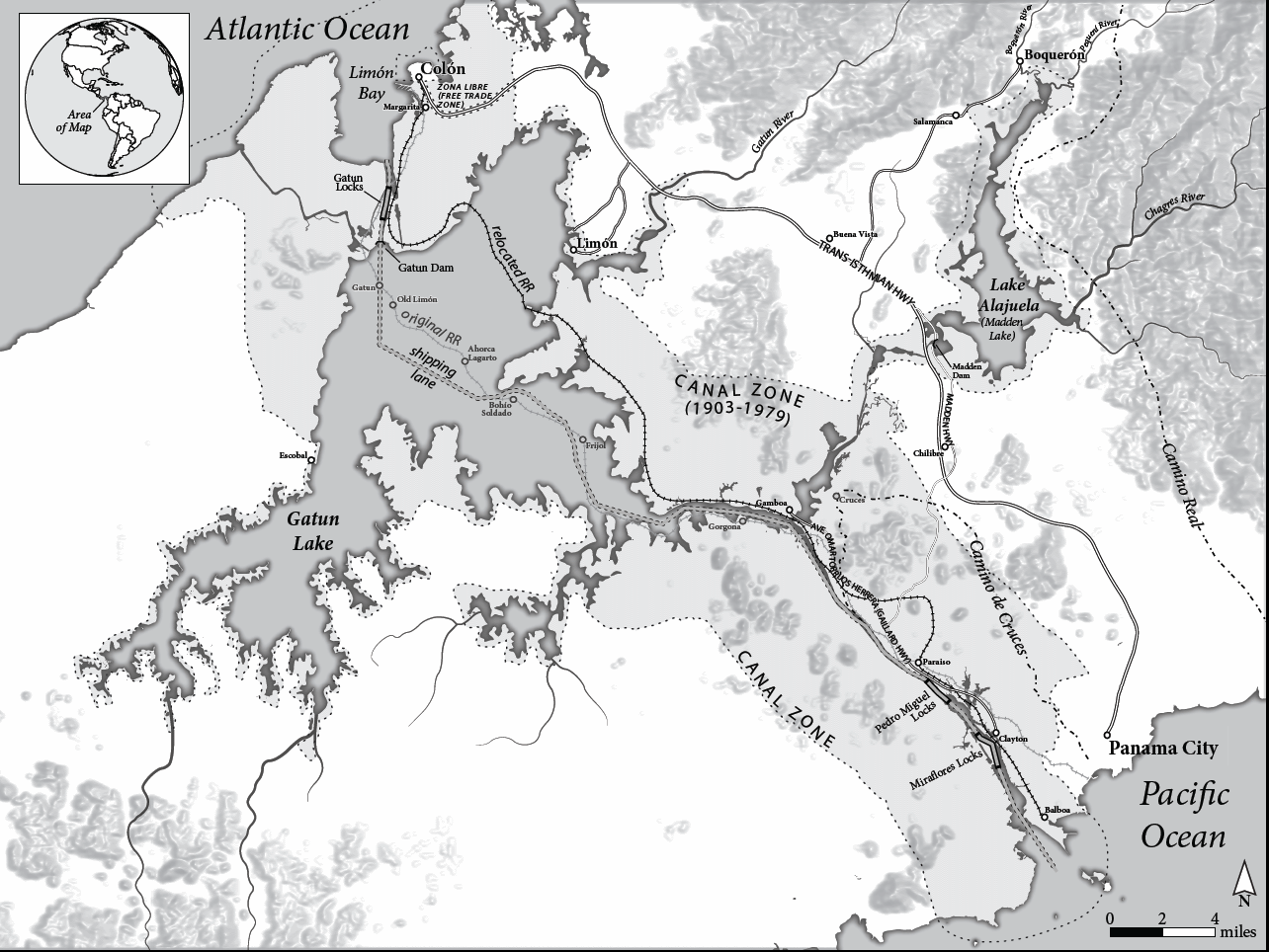
History of the Panama Canal (2013)
This map was designed for a forthcoming MIT Press book by anthropologist Ashley Carse. I used a combination of modern GIS data with archival maps of the region to trace old Spanish trade routes and the locations of towns which are now underwater. This was also my first time doing hillshade rendering using Blender.
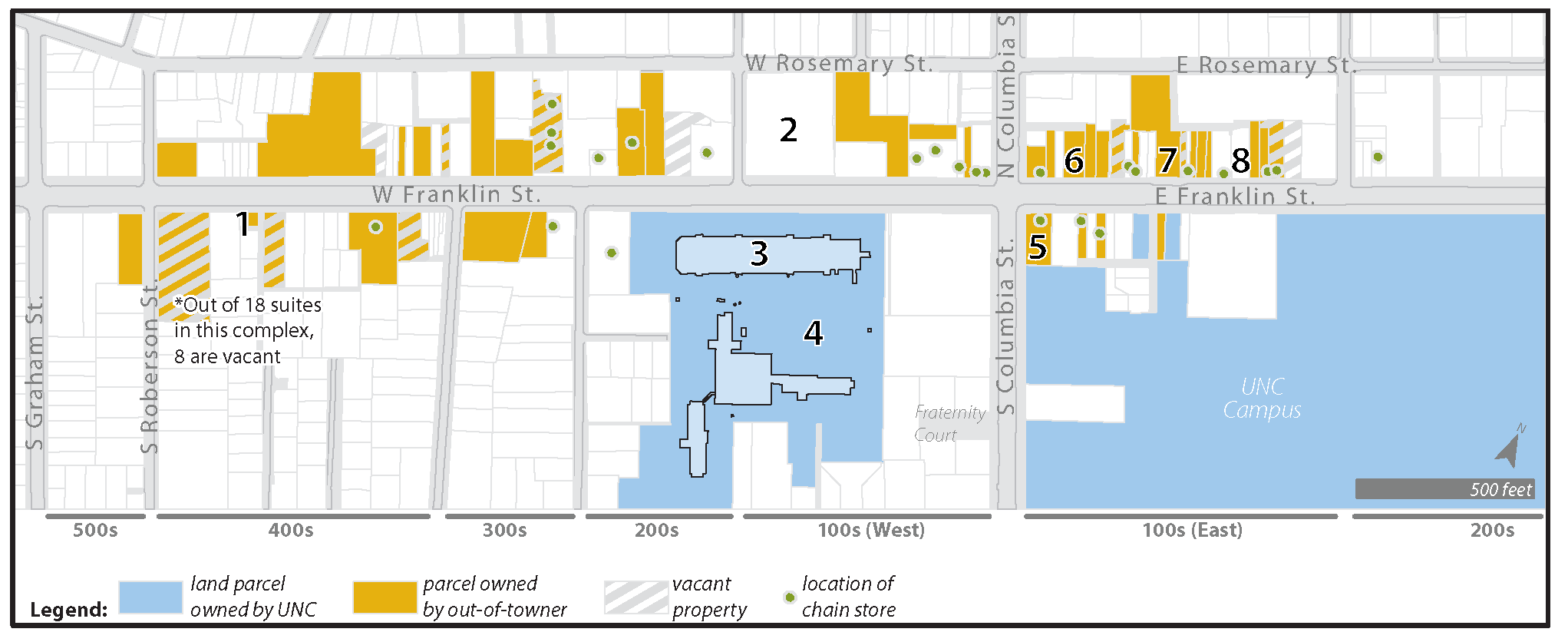
Franklin Street Businesses (2009)
I produced this map for an article in the Independent Weekly about trends in business ownership on Franklin Street in Chapel Hill, NC.
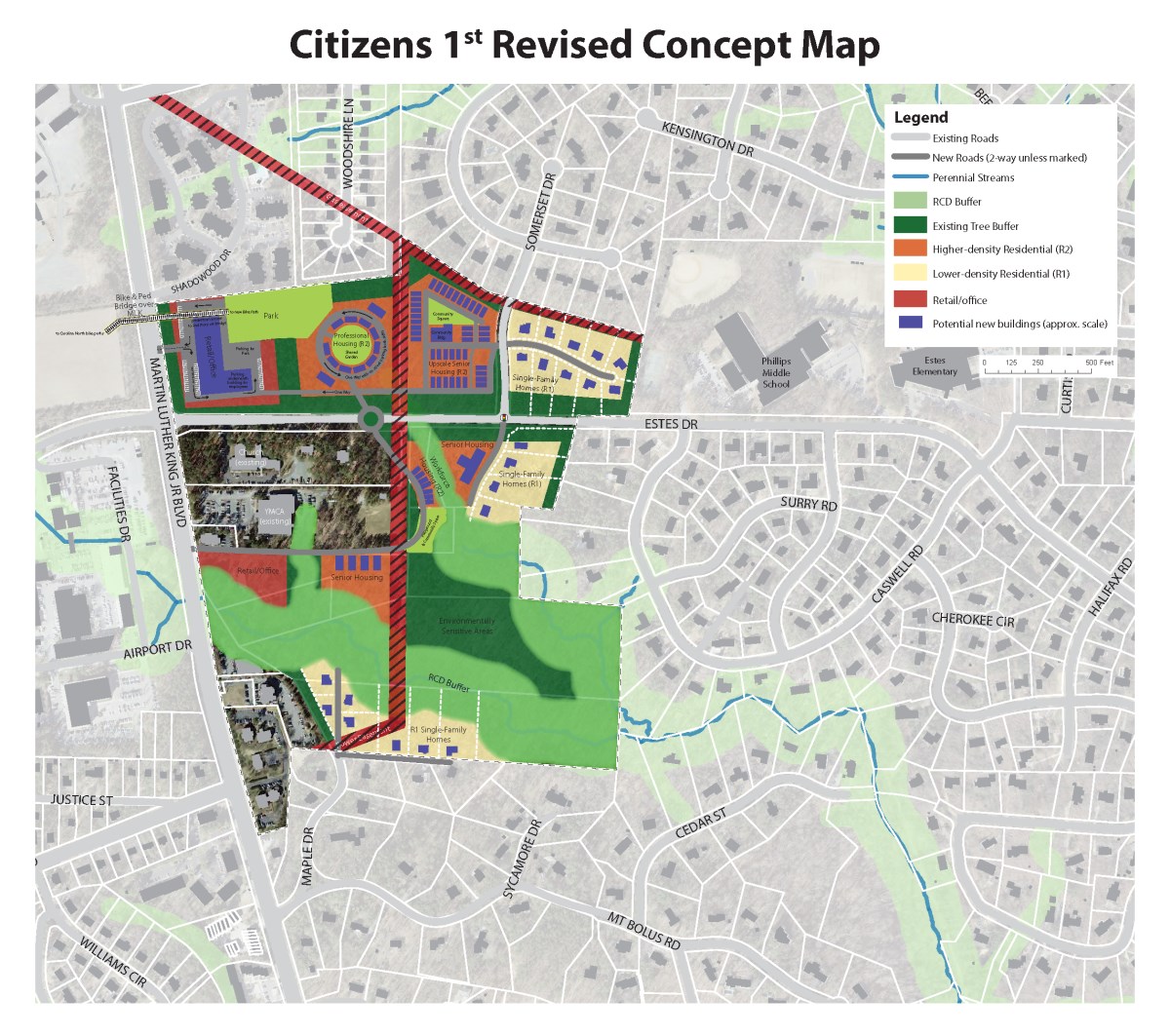
Concept Plan for Central West Chapel Hill (2013)
I was hired by a citizens group to turn their design ideas for Central West Chapel Hill into a professional concept plan that could stand on its own alongside maps designed by town consultants during a planning process.
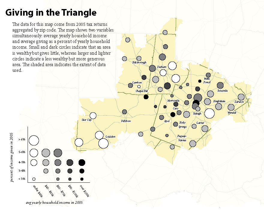
Giving in the Triangle (2007)
The Program on Public Life at UNC-CH commissioned a series of maps, including this one, for a report they produced on charitable giving in the Triangle. In this map, I examine the relationships between income level and propensity to give.
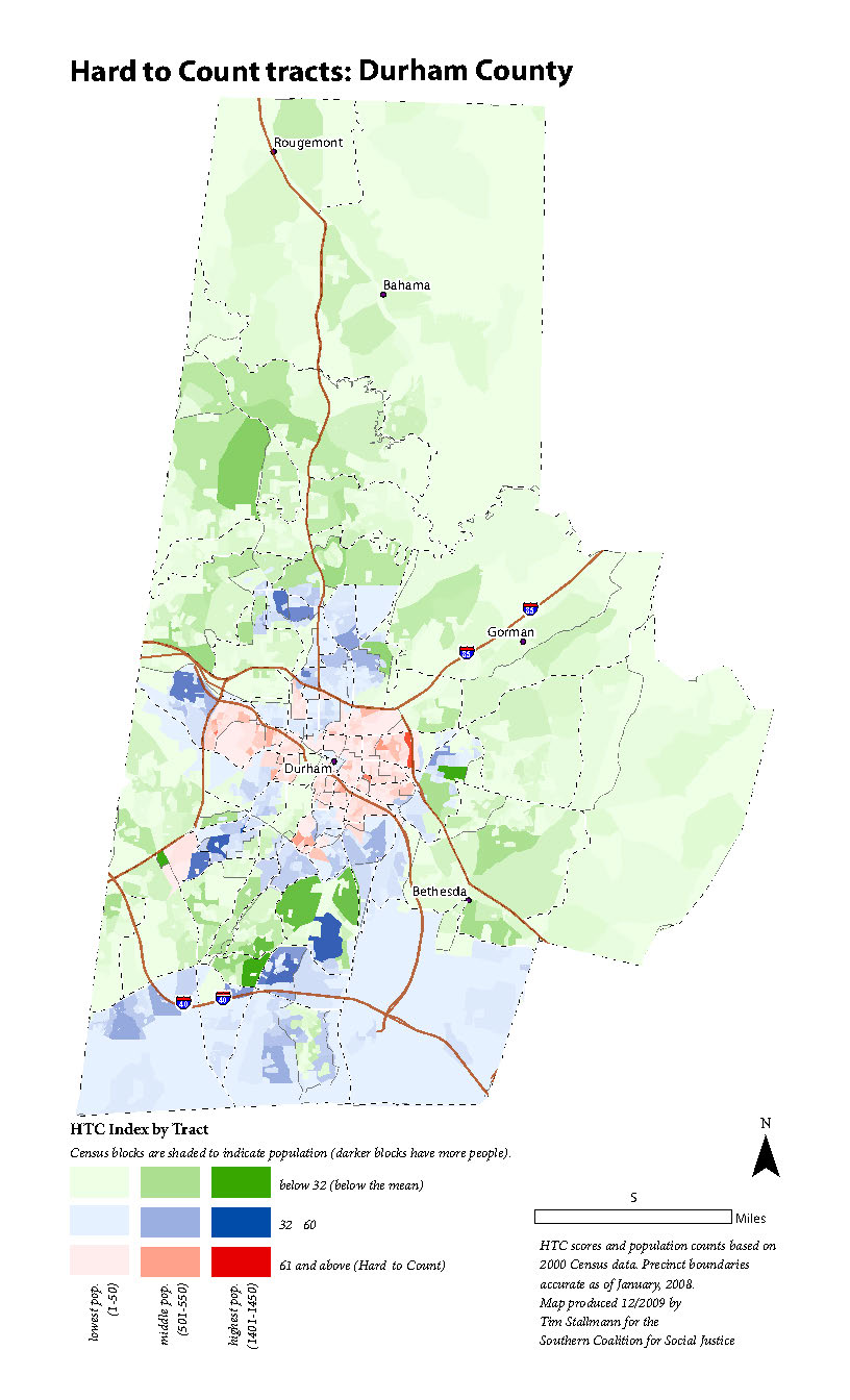
Census 2010 Outreach Maps (2009)
In preparation for the 2010 Decennial Census, the Southern Coalition for Social Justice worked with African-American, Hispanic/Latino and immigrant groups across the Southeast to spread the word about the impact of census participation on funding and recognition for historically-marginalized groups. Maps like this one were part of comprehensive outreach packets that I designed for each city or county SCSJ was working in; including information on where traditionally "Hard-to-Count" populations lived, as well as statistics on the estimated monetary impact of an undercount on that particular community.
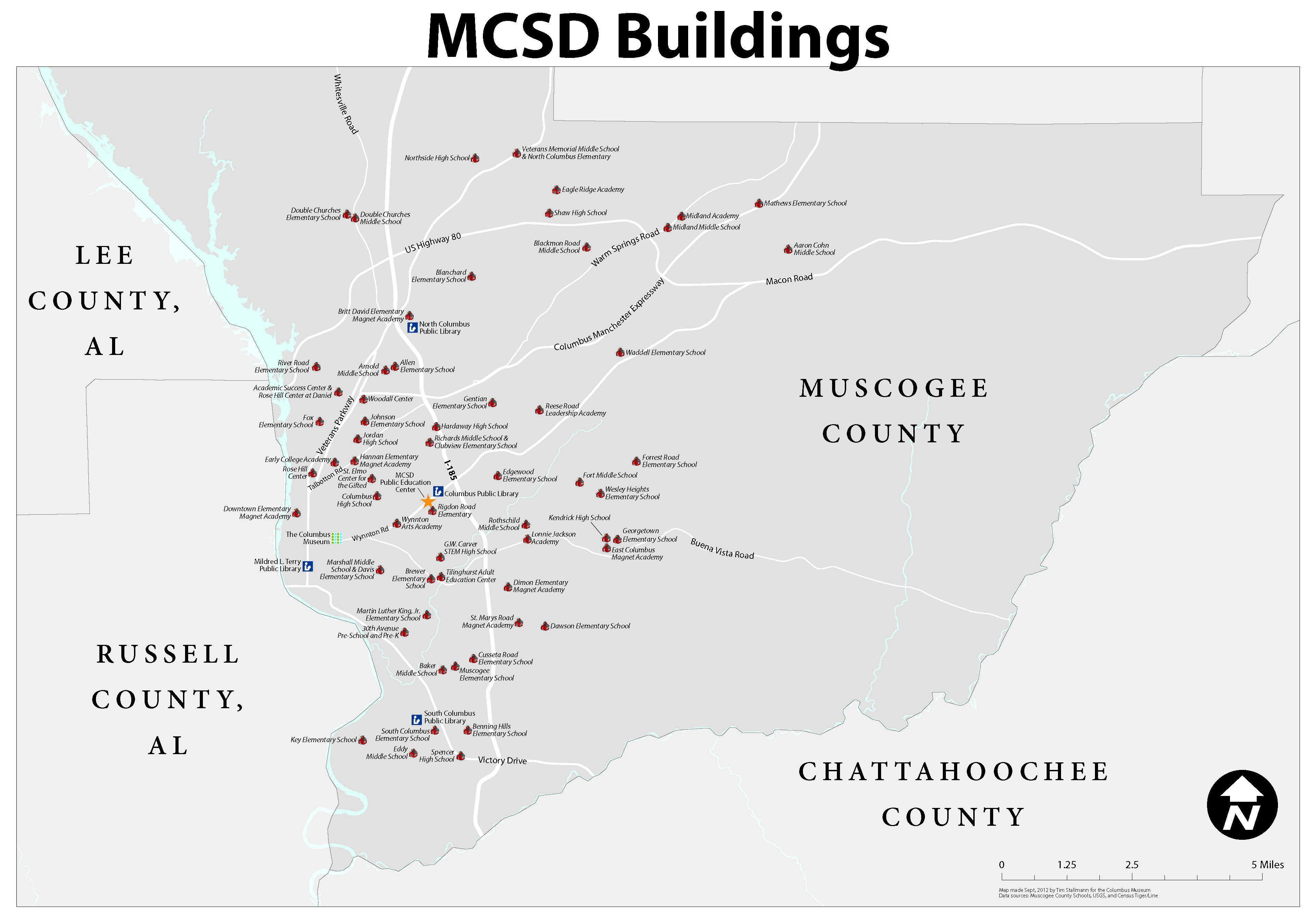
School map for the Columbus Museum (2012)
I produced this wall map of local schools for the Columbus Museum to use in publicizing a partnership with their school district.
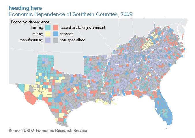
State of the South (2011)
This is one of several maps I produced for MDC's 2011 State of the South Report.
NYC Map for "Safe Space" (2012)
This map is one of several produced for Cristina Hanhardt's Safe Space. The maps help orient readers to New York City and San Francisco neighborhoods that Dr. Hanhardt discusses in the book.
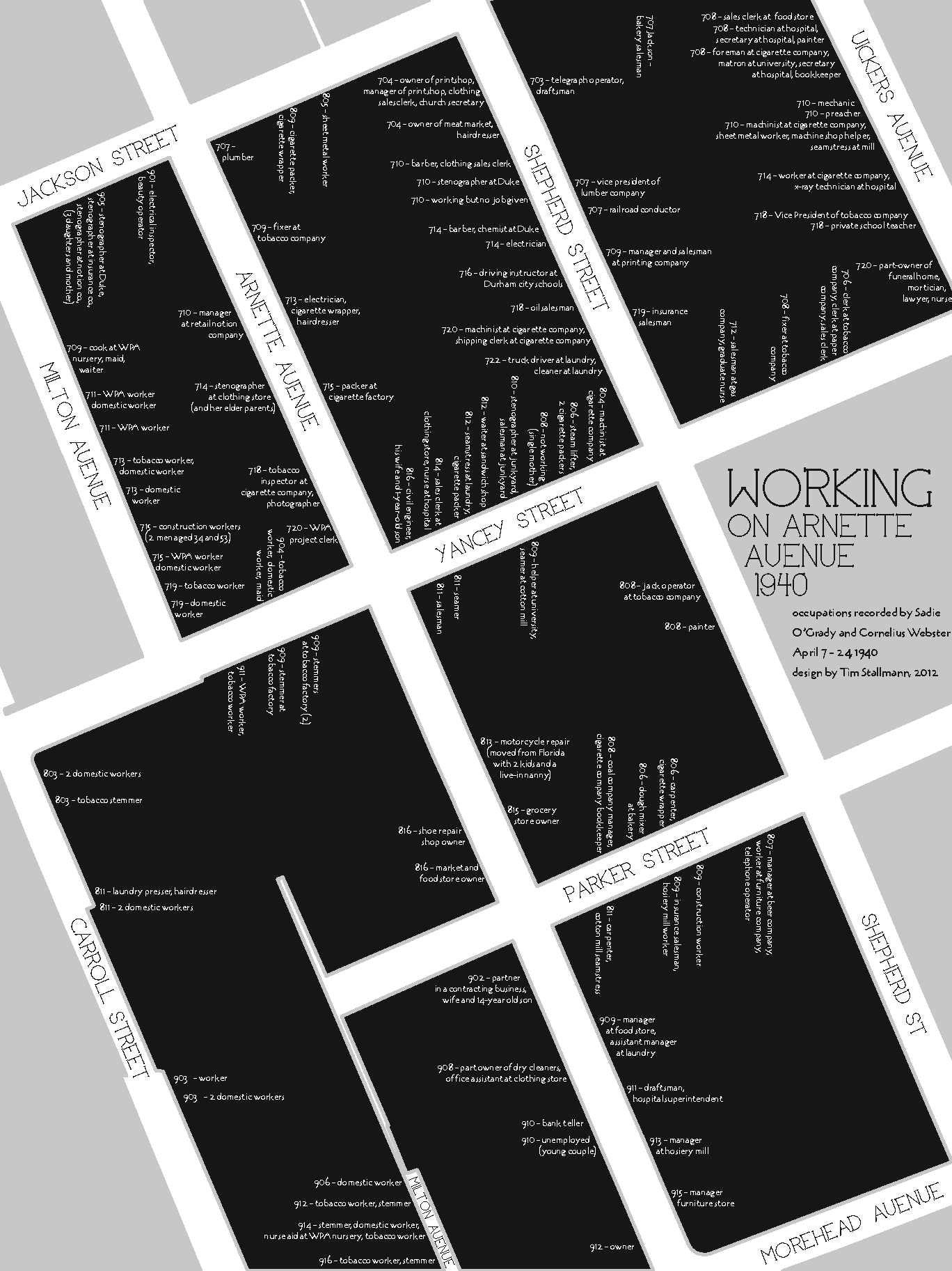
Who works on Arnette Avenue? (2012)
I made this map using the then-newly released PDFs of the full census records from 1930. By digging through the census enumerator's notes, I was able to reconstruct a snippet of the micro-geography of class and race in one neighborhood in Durham, NC.
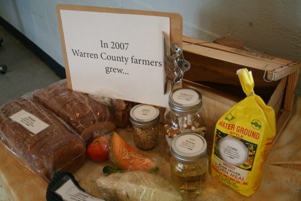
Growing Local, Buying Local
Collaboration with Working Landscapes to build a community conversation about rural economic development grounded in the rich agricultural history of Warren County, North Carolina. I coordinated maps and visualizations which responded to themes identified by county residents in a listening campaign.
None of the Above
Part of a with Hidden Voices theater project. I'm designing maps and visualizations for a traveling exhibit about the impact of the school-to-prison pipeline -- the ways that black and latina/o students are much more likely to be harshly disciplined for their conduct in school and as such end up in prison.
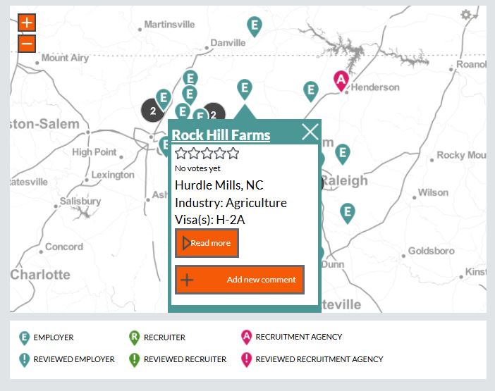
Contratados.org (2014-present)
Contratados.org (and also see coverage here) is a joint project with Centro de los Derechos del Migrante and Research Action Design. The site is best described as a "Yelp for migrant workers." I was part of a 3-person web team for the site along with Una Lee & Aylwin Lo. I developed the maps for this site using Drupal + OpenLayers, and also did some general Drupal development.
At Research Action Design, I'm part of a team which continues to lead development & maintenance of the site.
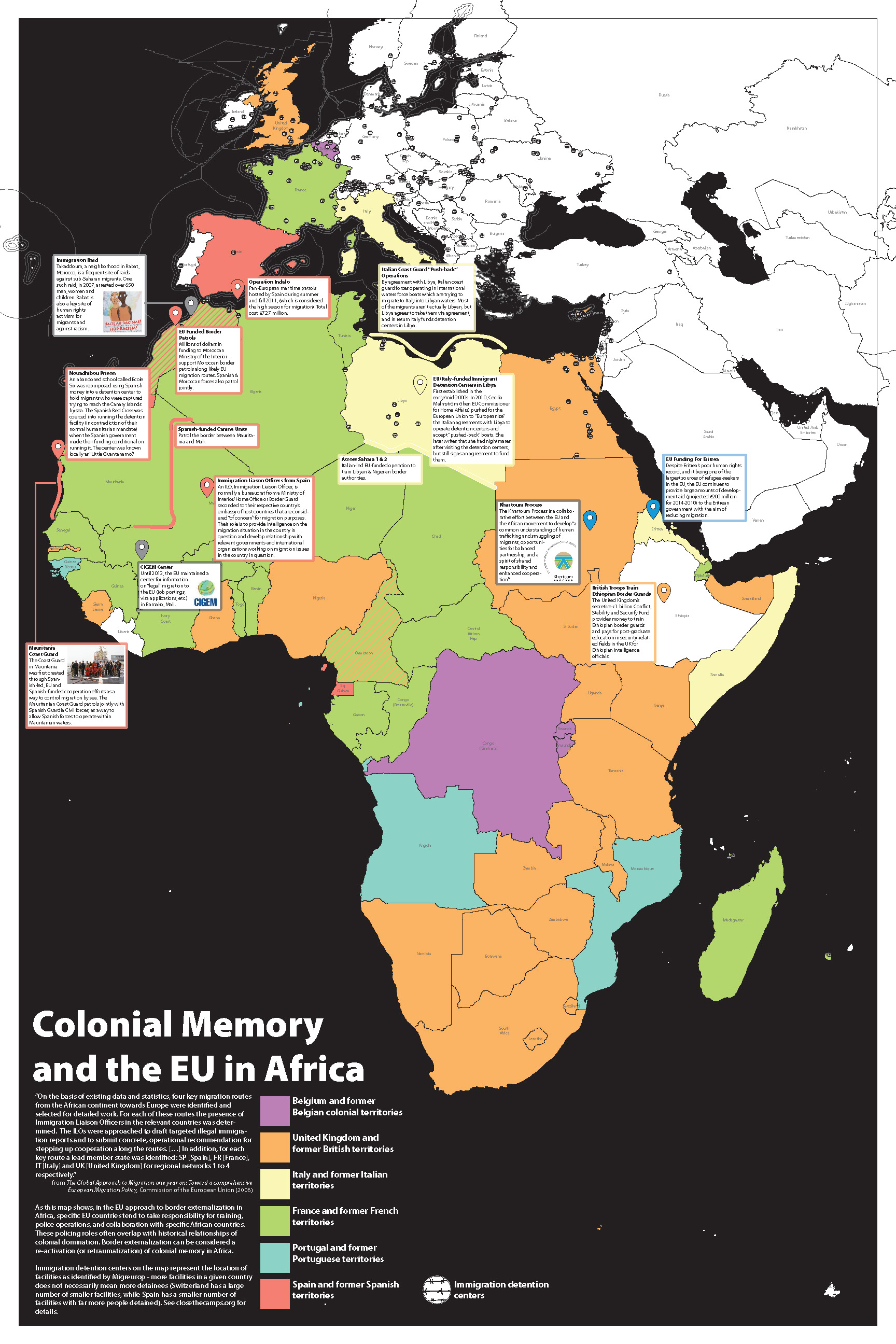
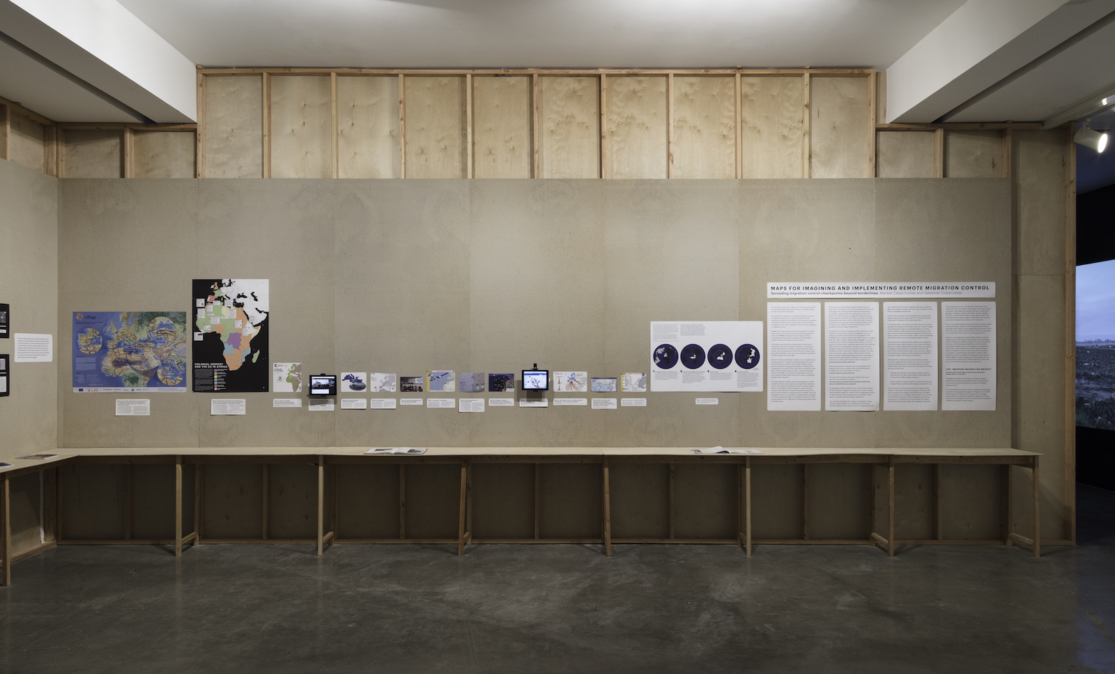
Colonial Memory and the EU in Africa (2017)
One of two maps I created to supplement Maribel Casas-Cortes and Sebastian Cobarrubias-Casas work in the It is Obvious from the Map exhibit at REDCAT gallery in Los Angeles, 2017.
From the description of the exhibit by co-curators Thomas Keenan and Sohrab Mohebbi:
It is obvious from the map examines the role of maps and map-making in the movements of large numbers of people from the conflict zones of the Middle East and Africa toward Europe. The exhibition takes its title from a detailed annotation on a fragment of a map depicting the border between Hungary and Serbia, a map made by migrants and exchanged among them on social media, a map that instantiates and attempts to realize a basic right to migration. But maps are not only the insignia of agency and the pursuit of new life. This show gathers three different moments of map-making from the current migration routes leading across or around the Mediterranean in order to chart the complex politics of migratory representations.
Gunpowder map of North Carolina (2015)
At the 2015 NACIS conference in Minneapolis, I took part in a gunpowder mapping workshop let by Matt Dooley, and produced this map of the coast of NC. At the workshop, we also produced a collaborative map of the Mississippi river basin, which was included in the Atlas of Design, volume 3.
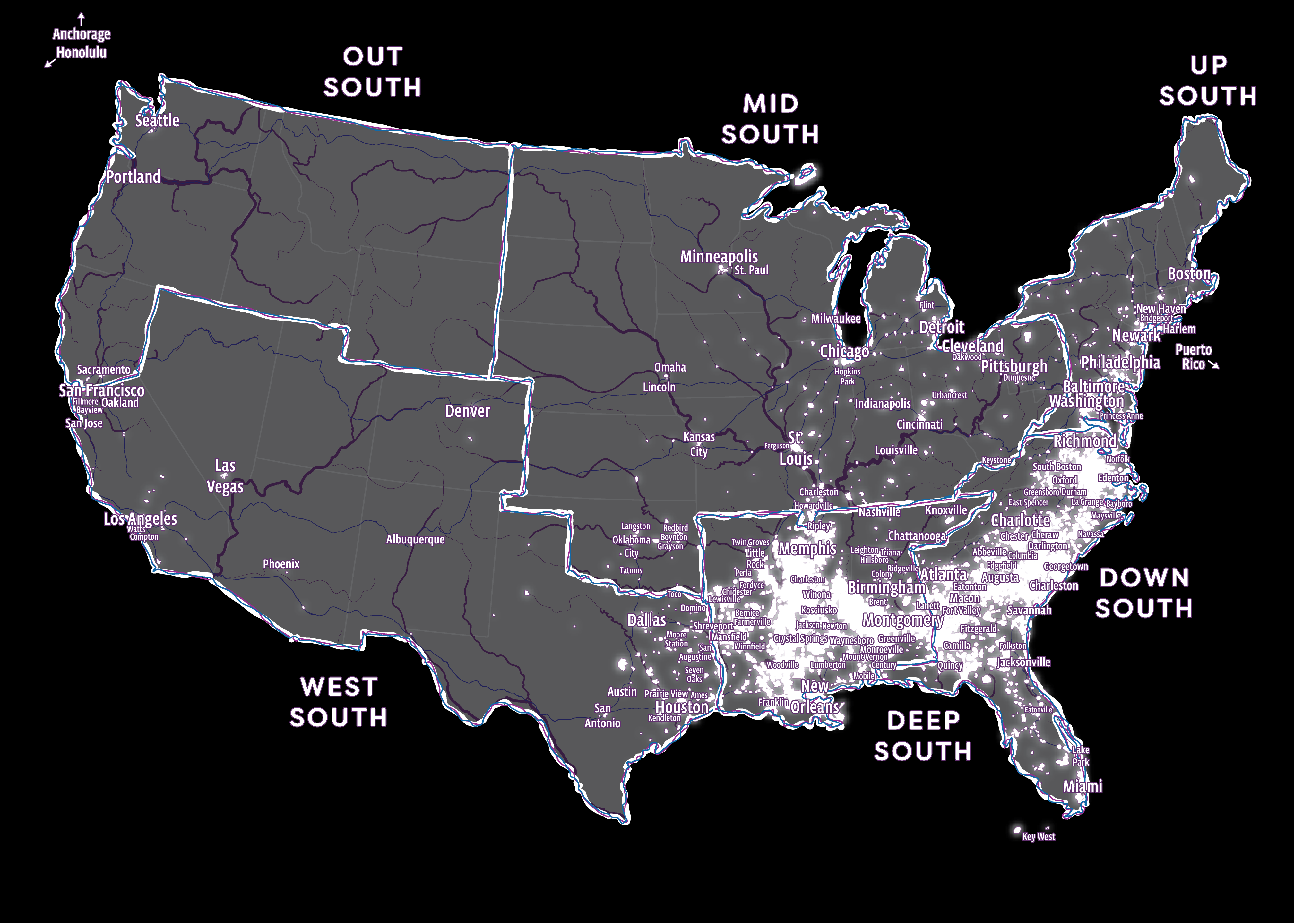
Chocolate Cities (2019)
Commissioned by Scalawag magazine to accompany Danielle Purifoy's review of Marcus Anthony Hunter and Zandria F. Robinson's Chocolate Cities. As I describe in the accompanying text:
This map draws on the geographic vision Marcus Anthony Hunter & Zandria F. Robinson lay out in Chocolate Cities: The Black Map of American Life to give one attempt. The map starts with some of the regions and key cities the authors highlight in their overview of the Black map. But I wanted also to foreground some of the smaller majority-Black cities and towns across the US which might not show up on a conventional map of the country, and so I drew in data from the US census to label incorporated places which the Census identified as majority-Black. The glow in the background highlights census blockgroups, tracts or designated places which had over forty percent of their population identified as Black (alone or in combination with other racial or ethnic identities). All census data was according to the 2012-2016 American Community Survey.
In some ways, this is a speculative cartography -- some of the named places are truly tiny population-wise, and the choice of what to name was often arbitrary -- but each of them, the many places highlighted but unnamed, and the many more which aren't even legible to the statistical viewpoint of this map, is a locus of the Black place-making which Hunter & Robinson argue is "the light toward both true civilization and broad liberation."
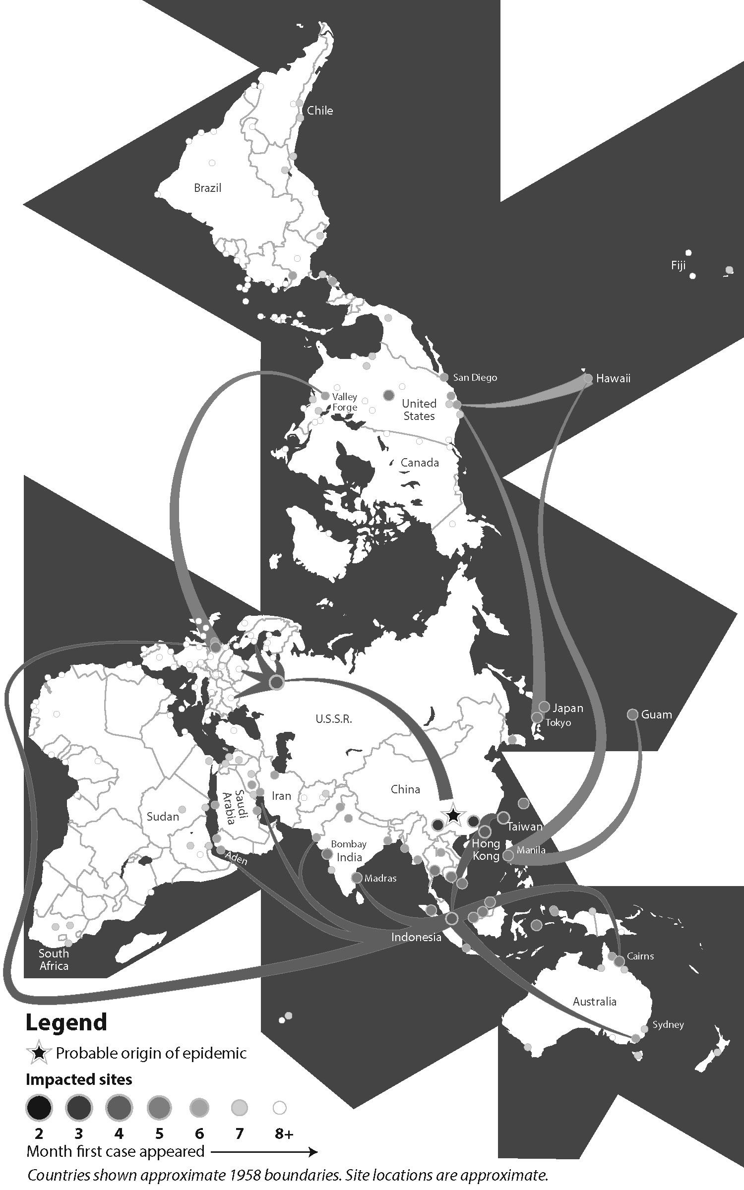
Avian Flu Spread (2019)
Remake of a 1960s-era WHO map of the spread of avian flu, to accompany a forthcoming Duke University Press book.